If you remove a control, who has to make the decision now?
Yoto is basically an audio player for kids where physical cards are used to choose what they listen to. A child picks a card, puts it into the top of the player and the audio starts. If they want a different chapter or the volume needs changing, there are two big orange controls to press or turn, and the tiny pixel display changes so they can see what the player is doing.
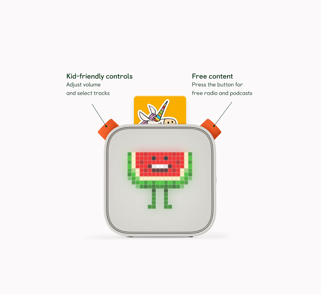
I found Yoto through a Design Better interview with co-founder Ben Drury, and what I found super interesting was how the kid mostly uses this little physical player while a whole other side of Yoto sits in the parent app. There is loads you could get into, but what I kept coming back to was why some decisions stay on the player and others get moved into the app.
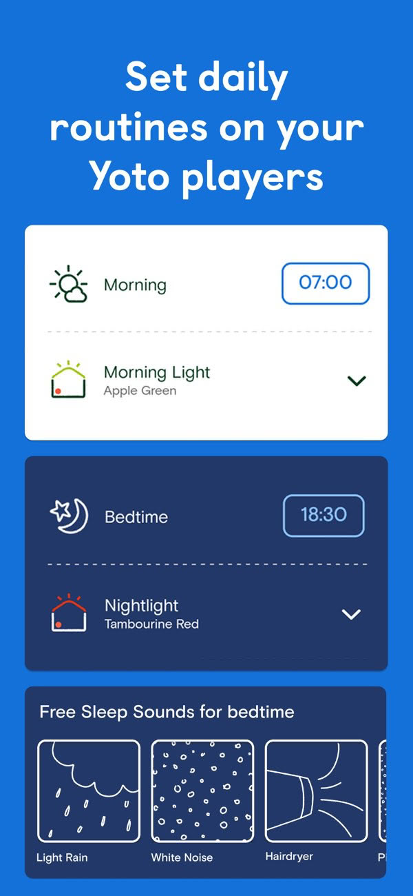
Looking at that on its own, it would be easy to say Yoto is simple because there is hardly anything on it. I don't think that quite explains why it works, because there is actually loads going on around this little box. There is a card library, player setup, volume limits, day and night settings, routines, button behaviour and family access. You open the app and there's much more happening than there is on the player.
At first that can look like the usual trick of making one interface clean by dumping all the awkward stuff into another one, but when you look at what those settings actually do, quite a lot of them are not things the kid needs while they are listening anyway. A parent can decide how loud the player is allowed to get at night, what time the morning routine begins or how the player's buttons behave. The child is choosing what to listen to, moving to the next chapter and changing the volume while it plays. So putting every control on the player would not make it more honest. It would mostly put the parent's settings in the kid's way.
Take the chapter control away
You could take the chapter control off the player and it would look simpler, but the first time a child wanted to skip ahead they would have to stop, find a parent, wait for their phone and ask them to do it in the app. That is a lot of extra work created by removing one orange control, and it would happen every time the kid wanted to make a completely ordinary choice while listening.
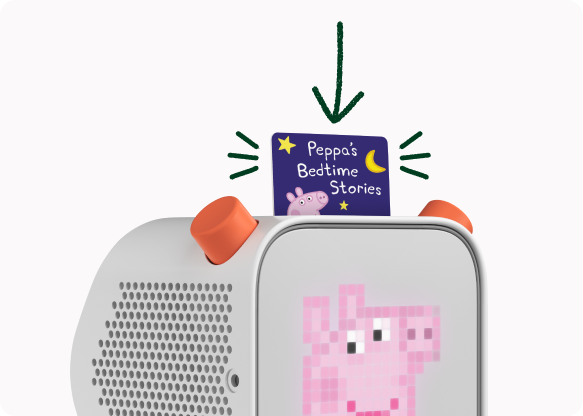
Putting in a card chooses what plays. The child can look through their cards, pick one and put it in themselves.
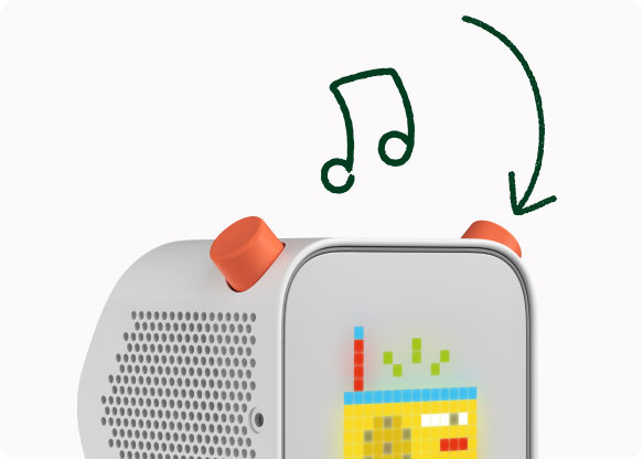
Pressing the right control starts Yoto's free radio or podcasts. They can start listening without having to go through the parent app.

Turning a control changes the chapter or volume. Those are small choices the kid can make while they are already listening.
This is where counting controls becomes a pretty poor way of judging whether something has been simplified. The chapter still needs changing. All that would have really changed is who can do it and how many people now have to get involved. If the kid has to borrow the parent's interface for something they were already in the middle of doing, the player may look simpler but using it is not.
The volume limit is different
The volume limit is slightly different and I think this is the more useful bit. A parent probably should decide how loud the player is allowed to get, especially if they want one limit during the day and another at night, so it makes sense for that setting to live in the app. The kid doesn't need control of that limit, but they are still the one turning the orange control when the player stops getting louder. The player needs to make it clear why turning it is no longer doing anything.
But I don't think you can just say 'the setting is in the right place' and stop there. The parent can set the limit in the app, but the player still has to deal with the moment the kid reaches it. If turning the control just stopped doing anything, the parent setting would be working exactly as designed and the child would still be left wondering whether the player had broken.
The same thing happens in software
I would run the same review in software. If a team moves export controls into admin settings, I would not just look at the cleaner report screen and sign it off. I would want to see what happens when somebody working in that report tries to export after the admin has switched it off. They do not need access to the admin setting, but if the export button has simply disappeared they are left guessing whether the report is broken, whether their account has changed or whether they need to ask somebody else.
Before I agreed to remove the control, I would take it out of the mock-up and ask the team to carry on using the product. Don't stop at the cleaner screen. Show me the next normal thing somebody tries to do.
If removing it sends them off to find a parent, an admin or another device, we haven't removed the work. We've moved it somewhere else.
And sometimes that is actually the right thing to do. The kid probably shouldn't be changing their own volume limit, just like somebody using a report might not be allowed to change an admin rule. But then I want to see what happens when that decision reaches them. Does the product explain why the volume won't go any higher? Does the report explain why export isn't available?
That's the bit I'd check whenever a screen gets "simpler": who has to make the decision now, and what does the person using the product see when that decision affects them?