Hey, what’s up 👋
If this is your first edition of the newsletter or your 30th, I want to thank you for being part of the Unicorn Club. It really does mean a lot.
Over the last 6-8 months I've been slowly changing the format of the newsletter. Build/Shape/Ship helped give it more structure, but it was still too close to curation with a bit of extra commentary from me.
And with where AI is now, curation on its own isn't enough, you can already get a daily drop of links and have something summarise the bits you might care about.
Unicorn Club needs to do more than that.
So from this week, I'll be doing one proper writeup on product decisions, details, and trade-offs that make the difference between good digital products and great ones.
I'll still pull from what is happening across the industry, but the point isn't to send you more links, I want to do the research, work through the messy bits in my own work, and give you something useful you can take into your product work.
And after all these years this feels like the right job for the newsletter. You and people reading it are the ones driving those decisions, shaping those ideas, and leading that work.
So let's start with the thing I keep seeing pop up as a talking point: "AI is going to kill the form."
The Breakdown 🧠
Old UI gets a new job
“Forms are dead, filters are dead, dashboards are dead, everything becomes a prompt.” - this is the type of thing I’m seeing from different people and tbf a lot of products doing this in their softwares already, but we know this can lead to LOTS of problems.
And just to be clear, I’m not really talking about ChatGPT answering a question in another tab. I’m talking about AI inside a product you own, where it can create, edit, approve, configure, or change something for the user.
Some of those screens where your users need to do certain things will go away but a lot of them will just get a different job.
💡 Take forms for example: If AI can read an invoice, pull details from an email, understand a screenshot, or fill something from a CRM record, a form probably shouldn’t be the place where someone starts typing everything from scratch.
But the user still needs to see what the system found. They need to see the missing fields, the guesses, the low-confidence bits, and what will happen if they approve it.
So the form isn’t always gone, it just turns into some sort of “review screen” so the system doesn’t feel like it is doing everything behind a curtain.
💡 Same goes for filters: If I can type “black football boots, size 11” or “family-friendly hotel near the station with a pool”, I shouldn’t have to rebuild that request with checkboxes and sliders.
But filters still help when I’m browsing, comparing, narrowing, or correcting what the system gave me.
Danger is false simplicity
This is the bit I think we as product designers need to be careful with. It becomes VERY easy to remove the old UI, add a magic input, and say the product is “simpler”.
Sometimes it will be simpler and sometimes you’ve just removed the part that helped people understand what was going on.
Useful question 🙋♂️
Start with the job, not the pattern
I wouldn’t start with: which UI patterns does AI replace?
I’d start with: what job was this screen/UI doing?
A setup wizard might become one review page.
A search results page might become an answer with sources, filters, and a way to ask again.
A table might become the place someone reviews a bulk change before it touches real data.
That isn’t just a nicer prompt to give to your AI, it’s a different job for the same part of the UI.
The old screen might have been doing a bunch of things at once:
AI can take over some of that but it can’t make the rest disappear.
When AI acts outside the product
I’ve been thinking about this in my own work too. At the fintech company I work at, we’re starting with MCP, the plumbing that lets assistants call tools and APIs, rather than AI inside the app. It lets people bring AI into the places they already use, like ChatGPT or Claude, and have it call real product APIs.
I think that can be the right move, but definitely makes the tradeoff obvious.
When the action happens outside your own UI, you can try to make the API safer, document the behaviour, and expose the tool properly, but you don’t fully own the review path so all the warnings, the diff, approvals, and undo bits are partly out of your hands.
That is why AI inside your products is a different design problem. If the AI can create, edit, spend, send, choose, rewrite, or configure something, your interface has to explain that work.
Spotify example 🎶
The boring details are the interface
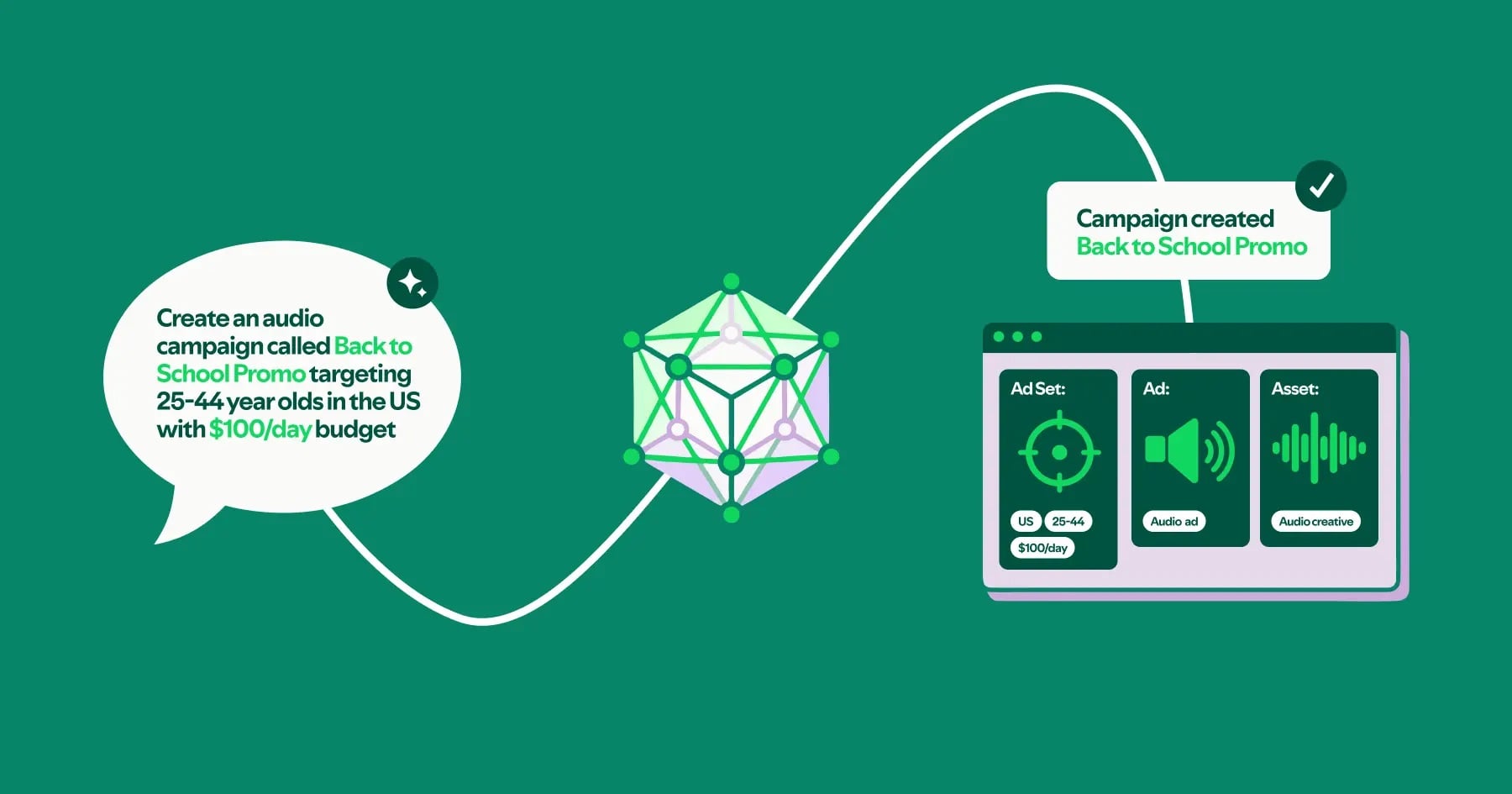
Spotify’s engineering write-up on its Ads API Claude plugin is a good example because it shows the work behind a plain-language request.
A user can ask for an ad campaign in normal English. Behind that, the plugin has to look up geo-targeting IDs, convert dollars into micro-units, validate audience size, create the campaign, create the ad set, and create the ad.
Which is a lot of stuff to hide behind one sentence.
Because those actions can spend real money, the boring details really do matter. Spotify talks about showing exact API requests as curl commands, respecting execution settings, asking for missing information, and planning idempotency keys so retries do not create duplicate campaigns.
Showing that messy middle bit is how you can gain a little more trust from your users when using AI.
Show what is about to happen. Show what changed. Show what still needs checking. Give the user somewhere to stop, fix, undo, or approve it.
Making the input box feel clever is cool and all, but if it messes something up you’ve just pissed someone off.
Keep the messy middle visible
This is where David Hoang’s Draftsmanship essay clicked for me too. Rough work is easier to question and finished-looking work gets trusted too quickly.
So if an AI creates a campaign, drafts copy, changes a layout, edits a customer segment, or prepares something for approval, I don’t just want the confident final answer. I want the messy middle to stay visible long enough to check it.
A lot of these flows probably need to look less like chat and more like a review surface with the “Original” next to “proposed changes”. Simple stuff like touched fields highlighted, but it boils down to keeping “Drafted” very separate from “approved”. Always making sure theres a way to undo so people can actually trust it.
The spec has a new reader
Ian Guisard’s Component.md makes a similar point from the design-system side.
His point is that design systems were mostly written for humans. Now tools are reading them too so if behaviour, accessibility rules, focus order, tokens, and edge cases are not written down clearly, the tool has to guess, and we’ve all had those moments where AI goes rogue…
So your component spec has to do more than describe what something looks like, it needs to explain how the thing behaves.
Again, the old thing still matters, it just has a new job.
What I'd do 🦄
Before you delete the screen
Pick one screen in your product that you’re looking to “replace with AI”.
Before deleting it ask:
Some slowness is a decision
Not everything should become a prediction though.
Some parts of a product are slow because they are badly designed, some are slower because the user is making a real decision.
AI can remove a lot of busywork which is good, obviously. But if it removes the screen that showed the mistake, the tradeoff, or the final check, the product hasn’t really become simpler, it has become harder to trust.
So when someone says “we can replace this whole flow with AI”, I wouldn’t argue with the idea straight away, I’d ask them to name the job the old flow was doing.
Then decide where that job goes and if they can’t answer that, they’re not simplifying the flow it’s just being hidden.