Dark Patterns in Sign-up: The Legal Risk Nobody Talks About
The conversation about dark patterns used to live in design ethics. It was a craft argument: these patterns are manipulative, they erode trust, they contradict what we claim to stand for as a profession. It was easy to dismiss.
That conversation has changed. Amazon just settled for $2.5 billion over dark patterns in its Prime cancellation flow. The EU has banned a list of specific design patterns. ADA accessibility lawsuits are landing seven-figure fines. The argument is no longer about whether dark patterns are wrong. It's about whether your product is currently carrying legal liability that the team doesn't know about.
What happened to Amazon
Amazon's Prime subscription cancellation flow became so deliberately complex that it was internally called "the Iliad flow." Users who wanted to cancel had to navigate multiple screens, dismiss multiple retention attempts, and make multiple explicit decisions, each one designed to increase the likelihood of abandonment before completing the cancellation.
Harry Brignull, who coined the term "dark pattern" and runs deceptive.design, documented the specific techniques Amazon used: roach motel (easy to get in, hard to get out), confirmshaming (making the "cancel" option feel like a mistake), and misdirection (drawing attention to retention offers while obscuring the cancellation path).
The $2.5 billion settlement was the result of a Federal Trade Commission investigation. The FTC's framing matters: this wasn't a design quality issue or a consumer satisfaction complaint. It was a legal finding that the user flow was designed to prevent informed consumer choice.
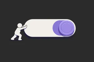
If your cancellation flow has more screens than your sign-up flow, you should read that sentence again.
What the EU has banned
The European Union's Digital Services Act and related consumer protection regulations have moved from vague principles to specific prohibitions. Several dark patterns are now explicitly illegal for services operating in EU markets:
- False urgency: Countdown timers, stock indicators, and other pressure tactics that are fabricated or misleading
- Guilt-tripping: Copy that implies shame or social failure for choosing the decline option ("No thanks, I don't want to save money")
- Hidden costs: Fees revealed only at the final step of checkout
- Forced continuity: Defaulting users into paid subscriptions after free trials without clear disclosure
- Disguised advertising: Paid content presented as editorial or user-generated content without disclosure
These aren't design guidelines. They're legal requirements. Products that include them in EU markets are in violation, regardless of whether anyone has complained yet.
The ADA dimension
Deceptive design isn't the only design that carries legal risk. Accessibility failures under the Americans with Disabilities Act have produced a stream of litigation against digital products over the past decade. What's changed recently is the enforcement focus.
The WCAG 2.1 and 2.2 standards that form the basis of most ADA web accessibility cases are increasingly being applied to flows, not just static pages. A cancellation flow that relies on visual-only indicators, that uses colour as the sole means of communicating the consequence of a button, or that isn't navigable by keyboard, is an accessibility failure that is also a legal exposure.
The AccessiBe case, documented extensively by accessibility expert Adrian Roselli, ended with a million-dollar fine. AccessiBe was an overlay tool that claimed to make websites accessible through an automated overlay. Courts found it did not satisfy the legal requirements. Teams relying on similar overlay approaches without proper implementation are in the same position.
The intersection of dark patterns and accessibility is particularly dangerous. A "confirm-shaming" button where the decline option is visually de-emphasised but also has lower colour contrast than the confirm button is both a dark pattern and an accessibility failure. Both vectors carry risk.
The patterns that carry the most risk right now
Not all dark patterns carry equal legal exposure. Based on the current regulatory and litigation landscape, these are the specific patterns that teams should audit immediately:
Roach motel (cancellation friction): Any flow where signing up takes fewer steps than cancelling. The FTC is specifically targeting this pattern following the Amazon settlement. If your product has a "cancel subscription" buried in account settings, behind a retention wall, requiring a phone call or email: that is legal exposure.
Pre-checked boxes: Especially for marketing consent, third-party data sharing, or auto-enrollment in paid services. GDPR requires explicit opt-in for data processing. Pre-checked boxes do not constitute explicit consent.
Hidden costs at checkout: Fees, taxes, and platform charges that appear only at the final confirmation step. EU consumer law requires these to be disclosed before the user commits to a purchase.
Dark mode / forced continuity in free trials: Free trials that require credit card details and auto-convert without clear, prominent disclosure of the conversion date and amount. The FTC's "click-to-cancel" rule, finalised in 2024, requires that cancellation must be as easy as sign-up and cannot require contact with a sales team.
Misdirection in consent flows: Cookie banners where "Accept All" is one click and "Manage Preferences" requires navigating multiple nested menus. EU regulators have been explicit that this pattern violates GDPR consent requirements.
If you want more thinking like this, Unicorn Club is a free weekly newsletter for senior designers and product teams.
How to run a dark pattern audit
The audit is straightforward. Block out half a day and walk through your highest-stakes flows as a new user: sign-up, upgrade, cancellation, and data consent.
For each flow, ask:
Is the path to the outcome I want clearly signposted? The user's desired outcome might be cancelling, declining, or choosing the free option. Is that path as clear as the path to the outcome you want?
Are there any fabricated pressure indicators? Countdown timers, stock availability indicators, "X people are looking at this": are these real or are they manufactured? If they're manufactured, remove them.
Does any copy shame or guilt the user for choosing the lesser option? "No thanks, I prefer to pay more" is confirmshaming. Remove it. It is now a liability, not a conversion tactic.
Are there pre-selected defaults that benefit the company at the user's expense? Subscription opt-ins, marketing consent, data sharing permissions: these must default to off or require explicit selection.
Is the ethical design applied consistently to both paths? The visual emphasis, size, and colour contrast of the decline option should be reasonably comparable to the confirm option. If "Cancel subscription" is grey, small, and requires a screen reader to find, that's the problem.
Can a screen reader user complete the flow without assistance? Accessibility in flows matters. If the cancellation path requires interactions that assistive technology cannot handle, that's both a WCAG failure and a potential ADA exposure.
The calculus has changed
The argument for dark patterns was always a short-term revenue argument. They lift conversion and reduce churn, but only for a while. The counter-argument was always an ethics argument. It was easy to dismiss.
The calculus changed when the legal system got involved. It's hard to argue that a cancellation flow is worth defending when it has generated $2.5 billion in legal liability. It's hard to argue that a pre-checked marketing consent box is worth the conversion uplift when it exposes the company to GDPR fines of up to 4% of global revenue.
The regulatory environment isn't getting lighter. The FTC's click-to-cancel rule has teeth. The EU's enforcement of DSA provisions is accelerating. The ADA litigation against digital products is not slowing down.
The right move is to audit now, before someone files a complaint. Because at that point, the conversation stops being about whether you should change the design and starts being about how much it will cost.
