User Flow Best Practices for Developer Handoff
Most user flows look beautiful and get completely ignored by the people who have to build them.
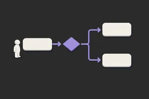
A designer spends two days in Figma mapping out a flow: boxes, arrows, decision points, and annotations. It looks clean. It gets shared in Slack. A developer opens it, spends 20 minutes trying to understand what the boxes mean, sees that the flow doesn't mention error states, and goes back to the spec. The flow is never opened again.
This happens because most flows are designed to look good to the design team, not to be useful to the dev team. The best flows are boring. They're over-documented. They mention the unsexy stuff like error handling, data loading, and edge cases. They answer questions before a developer has to ask them.
What makes a flow developer-ready vs just pretty
A pretty flow answers the question: what is the happy path? A developer-ready flow answers the question: what happens at every decision point, in every state, when everything fails?
Decision points need to be explicit. The question isn't "user checks box?" but "if checked, what happens? If not, what?" State coverage goes further than most flows bother with: what does the screen look like when empty, loading, errored, or succeeded? Labels need to match end-to-end. If a state is "ConfirmEmail" in the flow, it's "ConfirmEmail" in the codebase. Edge cases belong in the flow too, not held for a follow-up conversation. What if the API times out? What if the user goes back mid-step? What if two things happen at once? A developer should be able to pick it up and build without guessing at anything.
A pretty flow uses colour coding and custom shapes. A developer-ready flow uses standard symbols, clear annotations, and mentions every state the screen can be in.
The most common mistakes
Mistake 1: Happy path only. You design for the case where everything works. No error states, no loading states, no "empty state if no data." Developers have to invent these. They usually don't. Result: your product launches with blank screens and no error messages.
Mistake 2: Ambiguous branching. A diamond with "user logs in?" and arrows going left and right. But what counts as "logged in"? Is it after they enter credentials? After email verification? After they close the welcome modal? Dev team spends time guessing.
Mistake 3: Flows that don't mention data. The flow shows screens but not what data gets collected, where it lives, or what happens to it. A developer has to reverse-engineer the database model from your flow.
Mistake 4: Using custom shapes. Your flow uses a cloud for "third-party service" and a database cylinder for "backend." The dev team uses standard flowchart symbols and has to mentally translate your custom shapes into implementable steps.
Mistake 5: Missing the handoff context. The flow exists as a standalone Figma file. There's no link to the mockups. No reference to the API spec. No annotation about whether this state is blocking or non-blocking. Dev team has to hunt across five documents.
How to create an effective user flow
Step 1: Start with a single goal. Not "redesign the entire checkout." Rather: "what is the step-by-step journey from cart to order confirmation?" One goal. One entry point. One exit.
Step 2: Identify all possible states and branches. For each screen, ask:
- What's the happy path?
- What can go wrong? (API fail, network timeout, validation error, user goes back)
- What decisions does the user make? (yes/no, select one of three, enter data)
- Is there data loading? Show a loading state.
- Is there an error? Show the error state and recovery path.
Step 3: Decide on symbols and stick to them. Use standard flowchart symbols:
- Rectangle: screen or state
- Diamond: decision point (yes/no branch)
- Oval: start and end
- Arrow: transition with label (what happens, what user does, what condition is true)
No custom icons. No colours that need a legend. Simple and standard.
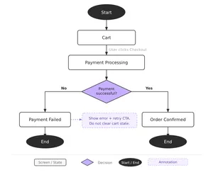
Step 4: Label everything twice: in the flow and in annotations. The box says "Payment Processing." Next to it, annotation says: "Show spinner. If succeeded, go to ConfirmEmail. If failed (retry limit exceeded), go to PaymentFailed. Timeout after 30 seconds."
This redundancy seems like overkill to designers. It saves dev time.
Step 5: Include a data map. A simple table: "Screen" | "Data Collected" | "Data Persisted". What data does each screen capture? Where does it go? (Form state, database, third-party service?) The dev team needs this.
Step 6: Call out blockers and non-blockers. Some transitions require API calls. Some are instant. Some are async. Mark these clearly.
Step 7: Link everything. The flow should link to:
- High-fidelity mockups of each state (happy path, error, empty, loading)
- API documentation (if external integrations are involved)
- Form validation rules (if data is being collected)
- The spec for any complex logic
Templates: three essential user flow types
Template 1: Happy Path Flow
The simplest version. User enters, takes steps, reaches goal. No branches. No errors. Use this for new features where the dev team is already familiar with the domain. Include all screens, no annotations.
Template 2: Decision Flow with Error States
Most common. Happy path plus all the ways it can fail. Each decision point branches to success or failure. Use this when error handling is critical: payments, authentications, data validation. Include loading states and error messaging.
Template 3: Complex Flow with Edge Cases
For workflows where multiple things can happen at once, users can go backwards, or state management is intricate. Onboarding, multi-step forms, or any flow where the user's path depends on their previous choices. Include state diagrams showing all possible combinations of conditions.
Tip: most flows are actually Template 2. You need the happy path plus errors. That's it. Template 3 is rarer than teams think.
The handoff: what developers actually need from your flows
Don't ask developers what they need; they'll say "clear requirements" and you'll send them a wall of text. Watch what they actually do: they open the mockups, cross-reference the flow, and build. Here's what moves that process faster:
1. One source of truth. Don't put the flow in Figma, the API spec in a Wiki, and design decisions in Slack. Use one tool (Figma, Miro, or a shared spec doc) and link between them. Devs should be able to start at the flow and click their way to every detail.
2. Exact state names. If a screen is called "PricingReview" in the flow, it's called PricingReview in the codebase. Naming consistency saves hours of translation.
3. Mention timing and dependencies. If state B can't happen until an API call from state A completes, say it. If the user can skip a step, say it. If a modal needs to animate in before the user can interact, say it.
4. Call out assumptions. Your flow assumes the user has a valid email. Your flow assumes the backend sends a specific error code. Write it down. Developers will build against these assumptions; misalignment causes bugs.
5. A working prototype. If you have an interactive prototype, link it from the flow. Developers learn faster from seeing real interactions than from reading descriptions.
Related: Check out The UX-Dev Relay for a deeper look at handoff communication beyond just flows.
A practical checklist before handoff
Before you hand your flow to dev, go through this:
- Every screen has a name that will match the codebase
- Every decision point branches to at least two states (success and error, or yes/no)
- Every screen has a loading state if it requires an API call
- Every screen has an error state if something can fail
- Every transition is labeled with what triggers it (user action, API response, system event)
- Empty states are shown if the screen displays data that might not exist
- The flow links to mockups, specs, and any dependent documentation
- One person on dev team has reviewed it and signed off
That last one matters most. Have a developer review the flow before it's considered final. Not to design, but to flag ambiguities.
Closing: flows are specs, not diagrams
The best flows read like a specification. You should be able to hand them to a mid-level developer and have them build it without a single follow-up question. Boring but clear always beats beautiful but vague.
Spend the extra two hours documenting error states and edge cases. Name everything consistently. Link to your other docs. Your future self and your dev team will spend fewer hours asking "what did you mean by this box?" and more time actually building. That's the whole point.
If you want more of this kind of thinking in your inbox, Unicorn Club is a free weekly newsletter for senior designers and design leads at SaaS companies. Practical, short, and worth your time.
