Empathy Maps: How to Use Them Without Wasting a Workshop
The empathy map goes on the wall on a Tuesday. By Thursday, nobody looks at it. By the following Monday, someone has pinned a sprint schedule on top of it.
This is not a failure of the tool. It is a failure of how teams use it. Empathy maps are not research artefacts. They are not something you fill in and file away. Used correctly, they are a forcing function: a structured way to surface what your team actually knows about users versus what it assumes, and to make those gaps visible before you design anything.
Used incorrectly, they are expensive sticky note sessions that produce a colourful poster nobody ever reads.
What an empathy map actually is
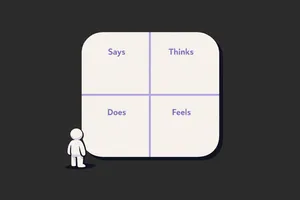
An empathy map is a one-page visual grid with four quadrants: what a user Says, Thinks, Does, and Feels. Some versions add Pains and Gains below. The point is not the quadrants. The point is the conversation that happens when a team tries to fill them in with real evidence and realises how little solid data they actually have. The discomfort is the value.
When they're worth running
Empathy mapping is worth doing when specific conditions are met. Not every project qualifies.
You have real qualitative data to work from. Interviews, observation sessions, support ticket themes, sales call recordings. If your team would be filling in the quadrants from assumption and gut feel, you are not empathy mapping. You are fiction writing.
Your team has low or inconsistent user understanding. When designers, PMs, and engineers carry different mental models of who the user is and what matters to them, an empathy map session forces that alignment. The exercise reveals the gaps. It works best when there is productive disagreement.
You are at the start of a design problem, not mid-execution. Empathy maps shape problem framing. If you already know what you are building, mapping serves no purpose. The time to do it is before the brief is set, not after the wireframes are started.
You need stakeholders aligned on user reality, not just requirements. Engineering leads and senior managers who live in feature lists often lose sight of the user behind the request. A properly run empathy map session, anchored to real data, is one of the few formats that gets non-design stakeholders genuinely thinking about user experience rather than output.
When to skip them
This is the part most guides leave out.
Skip empathy mapping when you have no real data. Running the session with invented personas and team assumptions produces confident-looking output that is wrong. Worse, it gives the team false certainty. If you have not done user interviews, watched real sessions, or read support data recently, run the research first. Then map.
Skip it when the team already has strong user understanding. If your designers have been in six user interviews this quarter and your PM talks to customers weekly, you probably know what to put in the quadrants. Do not run a workshop to restate what everyone already knows. Use that time to act on it.
Skip it for narrow, well-scoped problems. Adding a new filter to a list view. Fixing a broken error state. Improving a modal. These are not empathy mapping problems. You know the user, you know the task, you know what to fix. Match the method to the problem size.
Skip it when there is no decision downstream. If the output will not change anything: no brief, no design direction, no stakeholder position, do not run the session. The value of an empathy map is entirely in what it unlocks next. If there is no next, it is wallpaper.
How to run one that produces real output
The setup matters as much as the session itself.
Before the session: Gather your source material. Interview recordings, support ticket clusters, sales call themes, session recordings with annotation timestamps. Print or screen-share direct user quotes wherever you have them. The rule: nothing goes on the board that cannot be traced back to real evidence.
Who should be in the room: Keep it tight. Designer, PM, and one or two engineers if the problem is technical. Add customer success if you have someone who is on calls daily. Five to seven people maximum. Larger groups slow the session and dilute the quality of discussion.
Running the session (60 to 90 minutes):
Start with a specific user. Not "our users." One user type, one context. "A mid-market operations manager trying to onboard their team to our tool in their first two weeks." Specificity prevents the quadrants from becoming generic.
Work through the quadrants in this order: Says and Does first, then Thinks and Feels. Says and Does are observable: you can point to evidence. Thinks and Feels are inferred: they require more discussion and more honesty about what is a real insight versus a projection. Starting with the observable grounds the session.
For each sticky note, the facilitator should push for the source: "What is that based on?" If the answer is "I think..." or "I assume...", that sticky goes in a separate colour or is marked differently. By the end, you want two distinct sets: things you know, and things you are assuming.
Spend the last 15 minutes on the gaps. The assumptions and the blanks in the quadrants are a research backlog. Write them down. That list is what the empathy map actually produces.
Common mistakes
Filling it in before the session. A pre-populated empathy map is not an empathy map. It is a presentation deck shaped like one. The value is in the live negotiation: the moment when two people disagree about what a user actually wants and have to resolve it with evidence.
Using the map to represent all users. One empathy map, one user segment, one context. If you need to cover three user types, run three maps in sequence or pick the most important one. Trying to represent everyone produces a map that represents nobody.
Treating the quadrants as equal. Says and Does are richer starting points than Thinks and Feels. Teams that jump to emotional inference before they have nailed observable behaviour produce empathy maps full of projection. Ground the observable first.
No facilitator, no discipline. Someone needs to enforce the evidence rule, keep the conversation on track, and prevent the loudest voice in the room from filling in all four quadrants single-handedly. If that is not a dedicated facilitator, it needs to be a participant who accepts that role explicitly.
Skipping the gap review. The end of the session is where the map earns its keep. The list of what you do not know, surfaced by attempting to fill in the quadrants with evidence, is the output. Missing it means you ran a workshop but did not capture the result.
What to do with it after (the part everyone skips)
This is where most teams lose the value.
Within 24 hours: photograph or export the map, mark every sticky as either evidence or assumption, and convert the assumption list into concrete research questions. Assign ownership. Someone is responsible for answering each open question, with a deadline.
Use the map to brief designers entering the project. Not a tour of the artefact, but a walkthrough of what you know and what you are still working to find out. The assumptions column tells new team members exactly what they should challenge.
Return to the map after the next round of research. Add new evidence. Delete assumptions that turned out to be wrong. An empathy map that gets updated is a living brief. One that sits on the wall unchanged for three months is wallpaper.
If the map produced a strong insight, anchor your design decisions to it explicitly. Write in the design brief: "Based on interview evidence from [session], we know users feel overwhelmed at this step. This drives the simplification decision here." That trace from evidence to decision is what makes research count.
Close
Most empathy maps fail not because the method is flawed but because teams run them too late, with too little data, and no follow-through. The map is not the output. What you do in the 48 hours after the session is the output.
Run it when you have real data, a genuine knowledge gap, and a design decision that depends on resolving it. Skip it when any of those three are missing. And if you do run it: photograph the assumption list, assign owners, and come back to it.
That is the difference between a workshop that changes something and one that produces wallpaper.
If you want more of this kind of thinking in your inbox, Unicorn Club is a free weekly newsletter for senior designers and design leads at SaaS companies. Practical, short, and worth your time.
