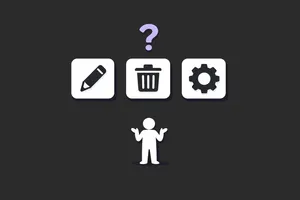
Affordances in UI Design (Where They Break)
There's a usability audit pattern I keep running into: a team ships a redesign, adoption tanks, support tickets spike, and everyone points at onboarding. Blame the docs. Blame the users. Build a tooltip. It's almost never the docs.
Most of the time, it's affordances. Specifically, it's interfaces that removed them in the name of "clean design", and now users pay the cognitive tax every time the screen loads.
If you need a primer on what affordances are, the glossary covers it.
A fast definition (then we move on)
Don Norman formalised "affordance" in design through The Design of Everyday Things. An affordance is the relationship between an object and a user, not a property of the object itself. A door handle affords pulling. A flat panel affords pushing.
The more useful concept for UI work is signifiers: perceptible signals that tell users what to do. Affordances exist in potential. Signifiers exist on the screen. You can have a clickable element that works perfectly fine but gives no visual indication it's clickable, and that's the whole problem.
That distinction drives everything that follows. Most failures in B2B SaaS aren't missing affordances. The click works fine. What's missing is the signal. The button functions. Users just don't know it's a button.
Where affordances break in modern UI
1. Flat design stripped the signal
Skeuomorphic design gets mocked, and fairly. Aqua-era macOS buttons with their gel highlights and faux shadows were excessive. Nobody misses them.
But the design pendulum swung past "clean" and landed on "ambiguous." When every surface looks identical (same background, same text weight, same spacing), nothing signals its function. Flat design, taken to its extreme, removes the visual vocabulary that tells users what's interactive.
The practical fallout is discoverability. Show a B2B product in usability testing and watch users hunt for something clickable. They hover over headings. They hover over labels. The actual action element, flat and the same colour as everything else, looks exactly like static content. Task completion drops. Frustration goes up. And nobody files a bug because nobody can point to what broke.
Visual minimalism feels like a UX virtue until you test it with real data and real cognitive load. That's where it stops working.
2. Ghost buttons are the canary in the coal mine
Ghost buttons (outlined, transparent-fill, low-contrast) have been the default secondary action treatment for years. They're worth studying because they show exactly where good intentions fail.
The reasoning is sound: visual hierarchy. Primary action gets emphasis. Secondary action sits quieter. That makes sense. The problem is that ghost buttons sacrifice clarity for that hierarchy.
On clean, white-background SaaS interfaces, they can work. On busy backgrounds, on dashboards packed with data, on any screen where the button border competes with surrounding content, they disappear. Or worse, they read as empty containers rather than interactive controls.
The real issue is where many teams make affordance decisions: at the component level, not the context level. A ghost button looks fine in Figma isolation. Put it on a real data table with alternating row colours, against a chart, against a coloured card background, and it fails. Teams ship ghost buttons because they look good in the component library. In production, the "Cancel" button becomes invisible.
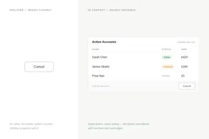
When I audit a product, ghost buttons are always the first thing I check in context, not in the design system. Nine times out of ten, there's a problem.
3. Flat icon buttons (with no labels)
Icon-only buttons are a recurring disaster. The logic sounds right: icons save space. Experienced users learn them. It keeps things clean.
Reality is different. Your B2B SaaS users are not power users working in your tool eight hours a day. They're occasional users. Someone checking a quarterly report. A manager reviewing approvals. A new employee three months in. For these people, icon buttons are a guessing game.
Common offenders:
- A three-dot overflow menu that contains the most critical actions on a row
- Edit/delete icons without labels on tables where those actions are permanent
- Toolbar icons that aren't tooltipped and aren't standard enough to be guessed
When users are already processing a dense table or complex form, they have no spare cognitive capacity left to decode ambiguous controls. Affordances need to be explicit.
Designing for expert users before the product has expert users is a pattern I see in almost every product I audit.
4. AI interfaces are importing all of these mistakes
AI-assisted features are shipping fast in B2B SaaS, and they're repeating the same affordance problems in new form. Users don't know what the AI can do, where it applies, or what inputs it accepts.
Take a concrete example: a SaaS product that adds an "Ask AI" button to the dashboard. User clicks once. If the response disappoints or the input model is unclear, they don't click again. The feature works. The affordance is real. But there are no signals guiding users toward appropriate use.
Notion does this better. Their AI triggers appear during the interactions where they're relevant: while you're writing, editing, summarising. The signal appears in context, not isolated in a sidebar. Users encounter it when the action already makes sense for what they're doing.
It's the ghost button problem in a new form: powerful capabilities shipped without any communication about how, when, or why to use them.
Signifiers fix this
The typical response to affordance failures is tooltips. Tooltip on the icon button. Tooltip on the AI feature. Tooltip on the ghost button.
Tooltips don't solve it. They require users to notice they need help and then ask for it, which is backwards. If you need a tooltip to explain your button, the button is broken.
Start with buttons that look like buttons. Not drop shadows and bevels, just enough visual treatment to clearly separate them from static content. Filled backgrounds, sufficient contrast, consistent shape. That's not an aesthetic call. It's what makes the thing usable.
Then labels. Icon-only controls should be reserved for genuinely universal actions with established conventions: Bold, Italic, Search. Everything else gets a label. In B2B SaaS, lean toward words. "Export CSV" beats a download icon every time. "Edit record" beats a pencil, especially when the action is irreversible.
Hover states do more work than most teams give them credit for. Their job is to confirm that an element is interactive before a user commits to clicking, which matters most on ghost buttons and ambiguous icon buttons. A cursor change helps on desktop, but it's not enough on mobile.
For AI features, annotations, and contextual menus, the placement is the signal. These should appear where the action is relevant, not isolated in a sidebar or floating in a corner. Contextual triggers are what make capabilities discoverable rather than just technically present.
A decision framework for auditing affordance failures
Run this against any B2B SaaS screen before it ships. (For a fuller review, see how to conduct a design audit that actually improves your product.)
Start with the five-second test. Show the screen to someone who has never seen the product. Five seconds, then ask what they can do here. If they can't identify two or three actions confidently, there is a missing signal, and you can usually find it in the next check.
List every interactive element on screen and rank them by importance. Then ask whether the visual treatment reflects that ranking. If the most critical action looks identical to a secondary one, the hierarchy has collapsed. Your visual system is telling users that everything matters equally, which means nothing does.
Both of these checks should happen in production, not in Figma. Ghost buttons on card backgrounds, on coloured headers, against data tables. Icon buttons next to similarly sized decorative icons. That's where component-level decisions fall apart: what reads clearly in isolation often disappears in real screen noise.
From there, find every icon-only control and ask a direct question: is this universally understood? A search magnifier passes. A product-specific action hidden behind a pencil icon does not. Product-specific controls need labels. The assumption that users will figure it out from context is the same assumption that broke your ghost buttons.
The new-user walk closes the audit. Have someone attempt the three most common tasks without guidance. Note every hesitation. Each pause is a missing signal, a place where the interface expected knowledge the user didn't have.
Where the breakdown happens
Affordance failures in B2B SaaS aren't usually ignorance. Most designers understand affordances. The problem is process.
Design reviews happen in Figma. Ghost buttons look fine there. Icon buttons look intentional. AI features look polished. The failures emerge in production: in a full browser, with real content, under actual cognitive load. White background, perfect contrast, no data noise. That's not what ships.
The gap between Figma and production is where most B2B SaaS usability debt piles up. Closing it requires testing in context, not just in the component library.
Flat design and minimalism work when applied with constraint and tested under real conditions. When they're defaults (clean is good, visual noise is bad), they systematically strip away the signals that make interfaces usable.
Ghost buttons reveal the pattern because they're everywhere. Teams defend them because they look good in the component library. But they're a symptom. The real problem is treating visual polish as proof of usability.
Before it ships or after
Pull up your product. Find the screen with the most critical user action and ask: if someone arrived here for the first time, how long would it take them to find it?
If the answer involves hovering or scanning, there's a signal missing. Not an onboarding problem, not a training problem. A design problem that got through the component library without ever being tested in context.
The frustrating part is it's usually not invisible in hindsight. You see it immediately when you look with fresh eyes. The question is whether you look before it ships or after the support tickets arrive.
