Alignment
What is alignment?
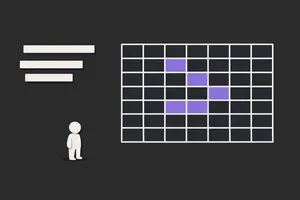
Alignment is arranging elements so they line up on a common edge or axis (e.g. left, centre, or a grid column). It creates visual order, connects related items, and supports hierarchy and readability. Consistent alignment makes UI feel intentional and easier to scan.
Use it when: you’re laying out a screen, form, or component. Align related elements (e.g. labels with inputs, cards in a grid) so the eye follows a clear structure.
Copy/paste checklist
- One primary axis – Choose a main alignment (e.g. left for LTR) for body and blocks; use centre or right only where it adds clarity (e.g. headline, numbers in a table).
- Grid or columns – Use a grid so elements align to columns and rows; avoid one-off offsets.
- Labels and inputs – Labels align with their inputs (e.g. top-left of input, or left-aligned label above). Be consistent across forms.
- Related content – Items in a list or card row share the same alignment so they read as a set.
- Consistent – Same type of content (e.g. all body text, all card titles) uses the same alignment across the product.
Why alignment matters
- Creates order so layouts don’t feel random or messy.
- Connects related elements (e.g. label + input) and separates groups.
- Supports hierarchy when primary content aligns to a clear axis.
- Improves usability and readability when the eye can follow a predictable path.
- Fits design systems when alignment is part of the grid and component spec.
What good alignment includes
Checklist
- Grid or system – Layout follows a grid (e.g. 12 columns) or spacing system so alignment is repeatable.
- Consistent – Same alignment for the same type of element (e.g. all left, or all centre in a card).
- Labels and controls – Form labels and inputs aligned consistently; see usability and form guidelines.
- No orphan alignment – Avoid a single element on a different alignment unless it’s intentional (e.g. a pull quote).
- Responsive – Alignment still makes sense at different breakpoints (e.g. stacked on small screens, aligned in a row on large).
Common formats
- Left alignment: Default for body text and blocks in LTR; strong vertical edge. Use for most content.
- Centre alignment: For headlines, hero content, or single CTAs. Use sparingly for long text.
- Edge alignment: Elements align to a shared left or right edge (or grid column). Use for cards, lists, and forms.
- Optical alignment: Slight visual tweak (e.g. for icons in buttons) so things look aligned even when metrics differ. Use when needed for polish.
Examples
Example (the realistic one)
Form: All labels left-aligned above their inputs; inputs full width of the form container; primary button left-aligned with the first character of the labels (or centred in the form if that’s your pattern). Card grid: All cards share the same width and align to grid columns; card titles and body left-aligned inside the card. Page: Main content aligns to a single column (e.g. max-width 720px, left-aligned or centred in the viewport). You use the same grid and alignment rules in wireframes and design system components.
Common pitfalls
- Mixed alignment: Some left, some centre, no logic. → Do this instead: Choose a rule (e.g. body and forms left; headlines centre) and stick to it.
- Ignoring the grid: Elements placed by eye; misaligned with each other. → Do this instead: Use a grid and snap elements to it.
- Centring long text: Hard to read. → Do this instead: Centre only short lines (e.g. headlines, single CTA); keep body left-aligned.
- Labels and inputs disconnected: Label centred, input left; or inconsistent from form to form. → Do this instead: Align labels and inputs the same way everywhere (e.g. label above, left-aligned with input).
Alignment vs. related concepts
- Alignment vs hierarchy: Hierarchy is order of importance; alignment is how elements line up. Alignment can reinforce hierarchy (e.g. primary content on the main axis).
- Alignment vs grid: A grid defines columns and rows; alignment is placing elements on those lines. Use a grid to make alignment consistent.
- Alignment vs white space: White space is the empty area; alignment is the line things sit on. Both contribute to order.
Related terms
- Hierarchy – alignment supports visual structure.
- White space – spacing and alignment work together.
- UI design – alignment is part of layout.
- Design systems – grid and alignment in the system.
- Wireframe – show alignment in wireframes.
- Typography – text alignment (left, centre, justify) is part of typography.
Next step
Pick one screen or form and check that all related elements share a clear alignment (e.g. left edge of content, or grid columns). Fix any misaligned labels, inputs, or cards. If you use a design system, ensure the grid and alignment rules are documented and used in your next wireframe or component.