Scalability
What is Scalability in Design?
Scalability in design is the ability of visual elements, layouts, and systems to adapt across different sizes, resolutions, devices, and contexts while keeping functionality and visual coherence. Scalable design behaves predictably whether viewed on a phone, tablet, or large display, and as content or features grow.
Use it when: you're defining layout, components, or a design system and want them to work across viewports and future growth without constant rework.
Copy/paste template
- Element or system: [component, layout, type scale]
- Scaling rule: [e.g. fluid width, fixed aspect ratio, breakpoint behaviour]
- Min/max or breakpoints: [where it stops scaling or changes]
- Content extremes: [short/long text, few/many items] and how they're handled
Why Scalability matters
- Reduces rework when you add devices, content, or features; one system adapts.
- Keeps the experience consistent so users aren't surprised by layout or behaviour.
- Supports responsive design and mobile-first by designing for change from the start.
- Makes maintenance easier: fewer one-off fixes per viewport or content length.
- Future-proofs the product as screens and contexts diversify.
What a scalable design approach includes
Checklist
- Relative units and flexible layout (e.g. rem, %, flex/grid) rather than fixed pixels where layout should adapt.
- Clear scaling rules (how components and type behave at different sizes or breakpoints).
- Content extremes considered (empty, short, long; one item vs many) so layout doesn't break.
- Consistent behaviour across the product (same component scales the same way everywhere).
- Documented in the design system or layout spec so implementation stays consistent.
Common formats
- Fluid layout: widths and spacing that scale with viewport (e.g. max-width and %, or container queries).
- Responsive breakpoints: defined points where layout or components change (e.g. stack vs grid); often paired with mobile-first design.
Examples
Example (the realistic one)
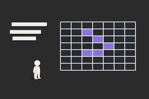
A card component is built to scale: image uses a fixed aspect ratio so it doesn't distort; title and body use a type scale and wrap; the card width is 100% inside a grid that goes from 1 to 2 to 3 columns by breakpoint. They test with one line of title, a very long title, and no image; the layout holds. Rules are documented in the design system so new cards follow the same behaviour.
Common pitfalls
- Fixed dimensions everywhere: layout and type break or look wrong at different sizes. → Do this instead: use relative units and flexible containers; define min/max and breakpoints where needed.
- Only one content length: design looks good with "lorem" but breaks with real content. → Do this instead: test with short, long, and empty content and define overflow/wrapping rules.
- No documented rules: every team implements scaling differently. → Do this instead: document scaling behaviour in the design system and implement via shared components/tokens.
- Too many breakpoints: a different layout for every device. → Do this instead: use a small set of breakpoints (or container queries) based on content and layout needs, not every device.
Scalability vs. related concepts
- Scalability vs responsive design: Scalability is the property of adapting well. Responsive design is the approach (e.g. fluid layout, breakpoints) that achieves it. Scalability can also apply to system growth (more features, more users).
- Scalability vs scalability in design: Often used interchangeably. "Scalability in design" sometimes emphasises design systems and organisational scale. Here, scalability focuses on visual/layout adaptation.
- Scalability vs design systems: A design system supports scalability by providing tokens, components, and rules that scale. Scalability is the outcome.
Related terms
- Responsive design
- Scalability in design
- Mobile-first design
- Design systems
- Aspect ratio
- Grid systems
- Design tokens
Next step
If you're defining layout and components, add scaling rules to your design system and use responsive design and mobile-first design. For system-wide scaling (teams, products), read scalability in design.
Related Articles
-
CSS Grid vs Flexbox: When to Use Each (and When to Use Both)
CSS Grid and Flexbox solve different layout problems. Reaching for the wrong one doesn't break your layout; it just creates extra work when the layout...
-
The UX-Dev Relay - How to Pass the Baton Effectively
Avoid dropped handoffs with proven strategies for smooth transitions between design and development. Learn the roles, responsibilities, and tools that...