Onboarding
What is onboarding?
Onboarding is the set of experiences that help new users understand your product and reach their first meaningful outcome (activation) as quickly as possible. It can include product tours, setup wizards, contextual hints, emails, and empty states. The goal is to reduce time-to-value and early drop-off.
Use it when: you have new users (sign-ups, trials, first install) and want to improve activation and retention. Design onboarding after you've defined "first value" and the minimum steps to get there.
Copy/paste checklist (onboarding design)
- First-value defined – What "success" looks like for a new user (e.g. "created first project", "invited one teammate").
- Minimum steps – Shortest path to that outcome; cut everything else from the first run.
- One primary path – One clear flow, not five optional tours; reduce choices.
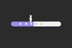
- Progress visible – User sees how far they are (e.g. "Step 2 of 3") and can skip or pause if you allow it.
- Contextual help – Hints or tips at the moment they're needed, not a wall of text upfront.
- Measure – Completion rate, time to first value, drop-off step; improve from data and usability testing.
Why onboarding matters
- Shortens time to first value so users don't leave before they see the benefit.
- Reduces support load by making the first steps clear and recoverable.
- Improves activation and retention when the first experience is focused and positive.
- Sets expectations and behaviour (e.g. "complete profile") that support long-term use.
What good onboarding includes
Checklist
- Goal-oriented – Tied to a clear "first value" or activation moment, not just "see features".
- Short – As few steps as possible; defer optional setup.
- Progressive – Reveal complexity when needed; don't overwhelm on day one.
- Respectful – Skip or "remind me later" where appropriate; no forced tours that block usage.
- Tested – Usability testing on the onboarding flow; measure completion and drop-off.
- Consistent with product – Same design system and tone as the rest of the product.
Common formats
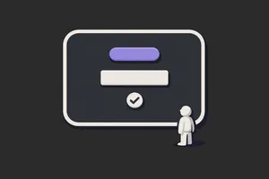
- Setup wizard: Step-by-step (e.g. account details, preferences, first action). Use when a few steps are required before use.
- Product tour: Highlights of key areas or features. Use sparingly; prefer in-context hints over long tours.
- Contextual hints: Tooltips or inline guidance when the user reaches a relevant screen. Use for "just in time" help.
- Empty states: Screens that explain what to do when there's no data yet (e.g. "Create your first project"). Use so blank screens aren't dead ends.
- Email sequence: Welcome and "next step" emails. Use to bring users back and guide them; keep it short and actionable.
Examples
Example (the realistic one)
First value: "User has created one project and added one task." Onboarding: (1) Sign up (email and password). (2) "Create your first project" – one field, one button. (3) "Add a task to the project" – one field, one button. (4) Done – they see the project and task; short tip: "Invite teammates from the menu." No tour; no extra steps. You measure: % completing step 2 and 3; time to complete. You find drop-off at step 2 and run usability testing to see why, then simplify or add one hint.
Common pitfalls
- Too long: 10 steps before they can do anything useful. → Do this instead: define the minimum path to first value; cut or defer the rest.
- Feature dump: tour of every feature instead of one clear path. → Do this instead: focus on the one path to first value; add contextual help later.
- No skip: users can't skip or exit and get frustrated. → Do this instead: allow skip or "I'll do this later" and still let them into the product.
- No measurement: you don't know where people drop off. → Do this instead: track completion per step and time to first value; use usability testing to understand why.
- Tone mismatch: onboarding feels like marketing; product feels like a tool. → Do this instead: match the tone and design system of the product.
Onboarding vs. related concepts
- Onboarding vs user flow: onboarding is a type of user flow focused on the first-run experience. User flow is the generic term for any path through the product.
- Onboarding vs activation: onboarding is the experience; activation is the outcome (e.g. "completed first value"). Good onboarding is designed to maximise activation.
- Onboarding vs training: onboarding gets users to first value quickly. Training is deeper learning (e.g. advanced features). Onboarding should be minimal; training can be separate (help centre, courses).
Related terms
- User flow – onboarding is a flow; map it and test it.
- Usability testing – test onboarding with new users.
- User journey – onboarding is the "first use" (or similar) stage.
- Touchpoints – onboarding spans several touchpoints (app, email, etc.).
- First value / activation – the goal of onboarding.
- Prototype – prototype onboarding and test before build.
- Design systems – keep onboarding consistent with the rest of the product.
- Microcopy – clear copy is critical in onboarding.
Next step
Define "first value" for your product, map the current onboarding flow (steps and touchpoints), and measure completion per step. Run usability testing with 5 new users and fix the biggest drop-off point. Then read User flow to document and iterate the flow.
Related Articles
-
Faster Time to Value: The Onboarding Principle Teams Miss
Most teams approach onboarding as a building problem. What should we add? A welcome modal? A product tour? A checklist to guide users through setup?...
-
Why Product Design is Important
When most people think of product design, it's still "make it look nice," with buttons, colours, and layouts. But that's just the surface. The real...
-
Onboarding: Why the First Minute Should Feel Safe
Around 70% of new users churn before ever engaging with a product's core features. The most common response is to redesign the onboarding flow: add a...