Hey hey 👋 I hope you're having a great day!
Alright so, I'd say we notice obviously broken AI design output, right? If something looks broken your team spots it straight away, has a bit of laugh at it, it gets deleted and you all move on.
What I’m talking about here is the next version of that problem: AI-generated product UI that looks like it has used your design system. Someone asks an AI tool to make a screen, adapt a flow, or turn a prompt into an interface, and on first pass it feels like it belongs in the product.
But there's a danger when it looks close enough to pass a review, like the spacing is roughly right, the card feels familiar, the button doesn't scream "I'm broken", and no one looks at it more deeply because it feels like the boring system work.
Then you look properly and it hasn't used the real components, the empty state has been made up, the disabled states are missing, accessibility rules never got near it, and error copy sounds awful.
So the review question is something like: "Can it show the receipt?"
Not some huge proof layer, but just enough to show what was actually used.
Looking right is not real evidence.
If the work cannot show what it used, treat it like a sketch.
This breakdown is actually a bit of a side quest to last week's edition. Last week was about what the user needs to review when AI does the work.
And this week is the step before that: can the work prove it came from the system in the first place?
Why the fake version is harder to spot 🔎
The lookalike is the trap
There is a big difference between a tool making something that looks design-system-ish and a tool that is actually using your system.
This can look like a tiny detail until you are reviewing a batch of AI-made UI and the first few look fine enough that nobody wants to be the person arguing about "component purity".
But those small skips are the bit that matter, because once a few fake versions get through review the design system starts drifting without anyone really noticing.
The Southleft Claude Design writeup is a really good read here because it shows the exact thing to worry about: the output feels system-aware, but underneath all it's doing is recreating the system rather than using it.
That doesn't make tools like this useless, and it definitely does not mean it will have the same limitation forever. But right now this is what you need to be thinking about: if the generated screen cannot tell you which real component it used, where it came from, which states it included, and what it guessed, I would treat it as a sketch and nothing more.
What the system does not say
All the boring design-system stuff suddenly matters a lot more when the reader is an AI tool.
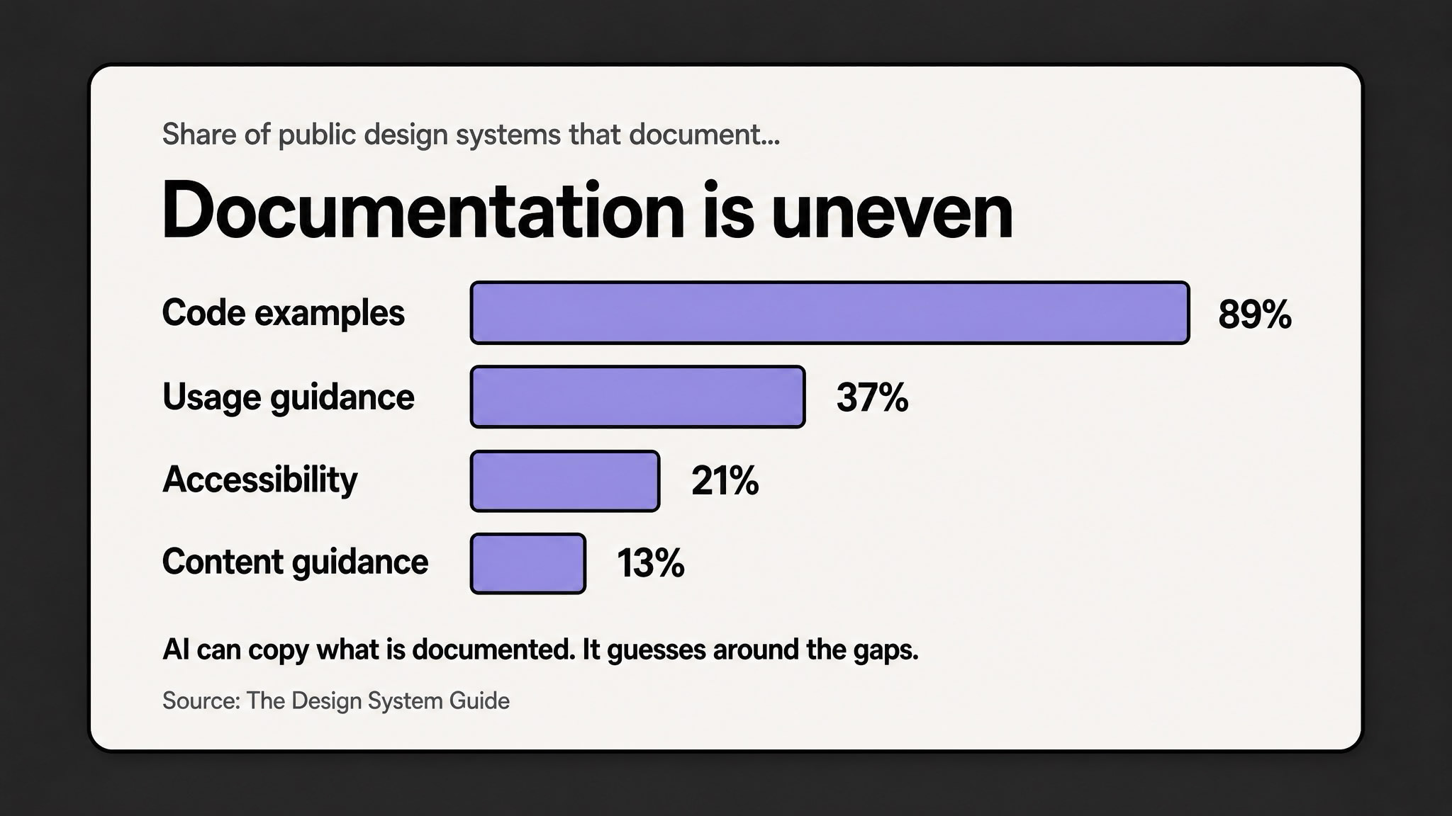
The Design System Guide looked at 158 public design systems, and the gap is pretty obvious - 89% had code examples, but only 37% had usage guidance, 21% covered accessibility, and 13% included content guidance.
That's already a problem for humans, but humans can cheat a bit. We remember the critique from last month, we know the weird product edge cases or we can just ask the person who owns whatever pattern we're working with.
Tools don't get that context, unless the design system gives them something to read/look at.
So if the system explains the visual layer but not the decision layer, the tool fills the rest in with whatever it THINKS is a good idea. Then it guesses when to use a component, which states matter, what copy belongs there, what the keyboard behaviour should be, and what should happen when the data is missing.
And because the guess that it made looks kinda polished, the team can mistake it for progress.
The receipt is the point
The receipt doesn't need to be fancy.
It just needs to show the real component name, what the import path was, the Figma or Storybook reference, any variants used, the required states, the accessibility and content rules, and anything the tool had to invent.
That gives you and reviewers something better to check than just "the vibe feels kinda right?". Because you can see whether it imported the real thing, included the right states, or just went and invented copy and behaviour.
What to do with it this week 👇
Start with one boring component
First let's start small here, I would not try to solve this across the whole design system, because it's going to become a huge task that never actually gets done.
I would start with one boring, repeated thing that AI is likely to fake.
Some examples: a card, modal, form field, dashboard widget, pricing panel, empty state.
Whatever turns up everywhere and can make your product worse when the wrong version spreads.
Then write the small receipt a tool and a human reviewer can both understand.
AI fidelity receipt
For one component or pattern, write down:
This is about making the fake version easier to spot before it spreads into every corner of your work.
Use AI to catch the boring drift
The zeroheight Design Systems Report 2026 points in the same direction: adoption is still the top challenge, and better documentation is one of the places AI can actually help.
This is where AI can be useful for you first. It can find components with no usage guidance, spot missing states, compare generated screens against real imports, and flag the accessibility notes nobody wrote.
Keep the rule simple
I do think AI can be brilliant for getting to a direction quickly, and I also think teams are going to create a lot of quiet product drift if they treat "looks right" as enough.
So I would keep the rule simple.
If the tool can use the real component, make it use the real component.
If it cannot use the real component, call it what it is: a sketch. Useful for thinking, maybe useful for an early conversation, but not production-ready system work.
The old version of design-system drift was someone making a one-off button.
The new version is a tool making twenty screens that feel close enough to pass a quick review, so the system has to explain more than the look.
So the new job is not just keeping humans consistent, but stopping tools from quietly creating a second product language that looks enough like the real one to slip through.
If the tool cannot show what it used, I would still call it a sketch.