UI Design
What is UI design?
UI design (user interface design) is the design of the visual and interactive surface users see and touch: layout, typography, colour, hierarchy, and components (buttons, forms, navigation). It makes the UX concrete on screen.
Use it when: you're defining how a screen or flow looks and behaves at the pixel level. UI design implements information architecture and user flows in a consistent, usable, and accessible way.
Copy/paste checklist (one screen or component)
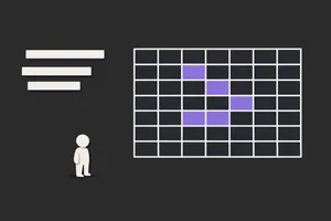
- Layout – Structure, grid, spacing; hierarchy of content and actions.
- Typography – Readable typography. Headings and body distinct.
- Colour – Purposeful use (e.g. contrast for readability, accessible colour contrast).
- Components – Buttons, inputs, links, etc. from design system or defined patterns.
- States – Default, hover, focus, disabled, loading, error. See interaction design.
- Accessibility – Keyboard, focus, colour contrast.
Why UI design matters
- Turns structure and flow into a clear, scannable interface so users can complete tasks.
- Builds trust and clarity through consistent, professional presentation.
- Supports usability and accessibility when contrast, focus, and components are designed in.
- Keeps products consistent when design systems and components are reused.
What good UI design includes
Checklist
- Clear hierarchy – Primary vs secondary content and actions visible. See hierarchy.
- Consistent components – Use design system or defined patterns; don't invent new ones without reason.
- Readable – Typography and contrast meet accessibility (e.g. WCAG AA).
- Responsive – Works across target viewports; touch targets and spacing appropriate.
- Feedback – Loading, success, and error states for key actions. See interaction design.
Common formats
- Component-based: Design and build from a shared set of components (buttons, inputs, cards, etc.). Use with a design system.
- Layout-first: Define grid, spacing, and hierarchy; then drop in components and content.
- High-fidelity mock or prototype: Pixel-level design in Figma/Sketch etc. for handoff or usability testing.
Examples
Example (the realistic one)
You're designing a settings screen. Layout: Single column; sections with headings and white space. Typography: Design system type scale; section titles and labels clear. Components: Toggles, text inputs, and primary button from the system. States: Focus visible for keyboard; error state for validation. Accessibility: Colour contrast checked; labels and errors associated. You hand off to dev or test in a prototype.
Common pitfalls
- No hierarchy: Everything has the same visual weight. → Do this instead: Use size, weight, and spacing to show what's primary; see hierarchy.
- Inconsistent components: New patterns every screen. → Do this instead: Use a design system or document patterns; reuse.
- Ignoring accessibility: Low contrast, no focus, tiny touch targets. → Do this instead: Design for WCAG AA; keyboard and focus from the start.
- UI without UX: Pretty but confusing flow or missing feedback. → Do this instead: Ground UI in user flow and interaction design; test with users.
UI design vs. related concepts
- UI vs UX design: UX design is the full process and experience. UI design is the visual and interactive surface. UI is part of UX.
- UI vs interaction design: Interaction design is behaviour and feedback. UI design is the look and layout. They overlap (states, components).
- UI vs visual design: "Visual design" often means look (colour, type, imagery). UI design usually includes layout and interactive components too. In practice they're often used together.
Related terms
- UX design – UI is one layer of the experience.
- Design systems – source of components and tokens for UI.
- Hierarchy, typography, contrast – core UI elements.
- Interaction design – behaviour and feedback.
- Accessibility and WCAG – UI must be accessible.
- Wireframe – structural sketch before full UI.
- Prototype – test UI in an interactive prototype.
- Usability – UI supports usability through clarity and consistency.
Next step
Pick one screen, ensure it has clear hierarchy, uses your design system (or defined patterns), and meets accessibility basics (contrast, focus). Test it with usability testing or a heuristic evaluation.
Related Articles
-

Best YouTube Channels for UI Designers in 2025
Most "best YouTube channels for designers" lists are just lists. No selection criteria. No sense of who the channel is for or what it actually...
-
CSS Grid vs Flexbox: When to Use Each (and When to Use Both)
CSS Grid and Flexbox solve different layout problems. Reaching for the wrong one doesn't break your layout; it just creates extra work when the layout...
-
The UX-Dev Relay - How to Pass the Baton Effectively
Avoid dropped handoffs with proven strategies for smooth transitions between design and development. Learn the roles, responsibilities, and tools that...